How to Design a Mountain Landscape Part 1: Composition and Planning
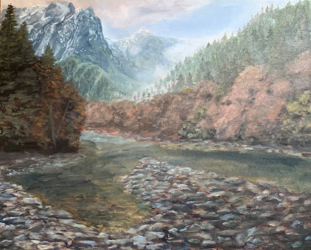
I grew up spending time here in there in Index, Washington. Just North of Seattle, it is home to lush forest, flowing rivers, and breathtaking vistas. I was asked if I could do a painting of the forest and mountains. I liked the atmosphere and colors of the picture but I wanted to add the river.
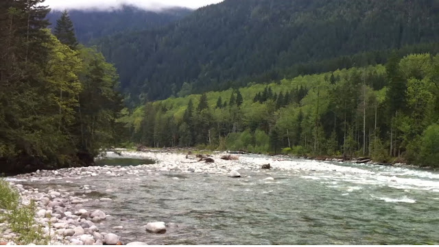
This was the first picture referenced taken by my dad. I enjoyed the atmosphere. The sky is grey but there is sunshine in certain areas of the picture. The clouds interact with the mountains. The trees indicate that this is during the fall months bringing in orange and brown tones.
This painting that has been in our house as long as I can remember depicts Mt. Index. Like the painting I want to create, the view is from the river. It acts as a good reference for my first pass but doesn't have any of the detail I want to add to mine.
I began by sketching some ideas for the painting. They combine bits and pieces from each of the reference photos like a collage. I decided to go with the sketch on the right because I wanted to show as much of the landscape as I could. I want to capture the verticality of the mountains like the sketch on the left.
The first step is sketching the painting out with a single color.
The whole painting is filled in now but a lot of the burnt sienna is still showing. I need to cover this up.
I like how the clouds move left to right. They begin high up and sweep down on Mt. Index and roll into the hills.
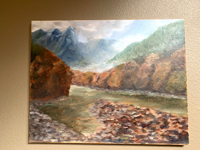
The painting really begins to emerge here. Refinements to every section bring the painting one step closer to being finished.
This image is a little darker. You can see where I added the snowfalls to the mountains and darken certain areas of the foreground trees so the highlights will stand out on top.
Here highlights are added to the trees and the rocks.


Comments
Post a Comment